Helvetica

September. 12,2007      NR
Rating:
7.2
Trailer Synopsis Cast

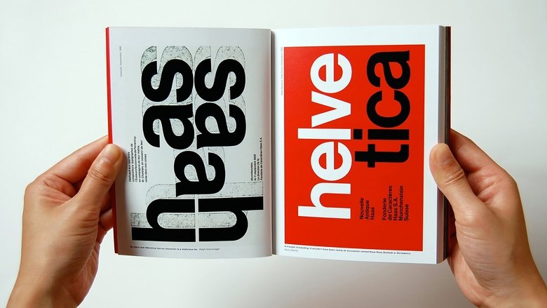
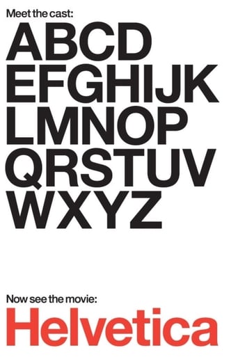
Helvetica is a feature-length independent film about typography, graphic design and global visual culture. It looks at the proliferation of one typeface (which will celebrate its 50th birthday in 2007) as part of a larger conversation about the way type affects our lives. The film is an exploration of urban spaces in major cities and the type that inhabits them, and a fluid discussion with renowned designers about their work, the creative process, and the choices and aesthetics behind their use of type.

Similar titles

24×36
24×36
A documentary exploring the birth, death and resurrection of illustrated movie poster art. Through interviews with a number of key art personalities from the 70s and 80s, as well as many modern, alternative poster artists, “Twenty-Four by Thirty-Six” aims to answer the question: What happened to the illustrated movie poster? Where did it disappear to, and why? In the mid 2000s, filling the void left behind by Hollywood’s abandonment of illustrated movie posters, independent artists and galleries began selling limited edition, screenprinted posters — a movement that has quickly exploded into a booming industry with prints selling out online in seconds, inspiring Hollywood studios to take notice of illustration in movie posters once more.
24×36 2016
The Atomic Cafe
The Atomic Cafe
A disturbing collection of 1940s and 1950s United States government-issued propaganda films designed to reassure Americans that the atomic bomb was not a threat to their safety.
The Atomic Cafe 1982
The Persuaders
The Persuaders
PBS Frontline takes an in-depth look at the multibillion-dollar "persuasion industries" of advertising and public relations and how marketers have developed new ways of integrating their messages deeper into the fabric of our lives. Through sophisticated market research methods to better understand consumers and by turning to the little-understood techniques of public relations to make sure their messages come from sources we trust, marketers are crafting messages that resonate with an increasingly cynical public.
The Persuaders 2004
Hollywood at Last!
Hollywood at Last!
Dedicated Dutch graphic designer Piet Schreuders visits Los Angeles to investigate all kinds of typeface as used in title-credits for movies and TV-series, letters on billboards, shop-windows or street-signs, the banner-headlines of The Los Angeles Times, and climbs finally to the giant letters of the HOLLYWOOD-sign. In the meantime he discovers, to his great satisfaction, the location and stairs where Stan Laurel and Oliver Hardy shot their movie 'The Musicbox', by combining street-signs, partially shown on still-pictures of this movie: "…MONTE" and "…ENDOME", which turn out to be found on the street corner of Del Monte and Vendome in Culver City. This documentary is bluntly intercut with commercials, a phenomenon not yet known in the Netherlands in 1979. (Theo Uittenbogaard)
Hollywood at Last! 1979
The Codes of Gender
The Codes of Gender
Arguing that advertising not only sells things, but also ideas about the world, media scholar Sut Jhally offers a blistering analysis of commercial culture's inability to let go of reactionary gender representations. Jhally's starting point is the breakthrough work of the late sociologist Erving Goffman, whose 1959 book The Presentation of the Self in Everyday Life prefigured the growing field of performance studies. Jhally applies Goffman's analysis of the body in print advertising to hundreds of print ads today, uncovering an astonishing pattern of regressive and destructive gender codes. By looking beyond advertising as a medium that simply sells products, and beyond analyses of gender that tend to focus on either biology or objectification, The Codes of Gender offers important insights into the social construction of masculinity and femininity, the relationship between gender and power, and the everyday performance of cultural norms.
The Codes of Gender 2010
Merce Cunningham: A Lifetime of Dance
A history of the work of Merce Cunningham.
Merce Cunningham: A Lifetime of Dance 2001

You May Also Like

Death Metal Angola
Death Metal Angola
Following nearly 40 years of unrelenting war, peace and reconstruction are slowly arriving to Angola. Huambo, Angola’s second largest city, finds 55 children in the Okutiuka orphanage under the care of Sonia Ferreira. Her boyfriend, Wilker Flores, is a death metal guitarist who uses sounds and rhythms of this hardcore music as a path to healing. Or, as Sonia says, “to clear out the debris from all these years of war.” The feature documentary follows Wilker and Sonia’s attempts to stage Angola’s first-ever national rock concert, bringing together members from different strands of the Angolan hardcore scene from different provinces, as it all unfolds in fits and starts, against the bombed out and mined backdrop of the formerly stately Huambo.
Death Metal Angola 2014
Objectified
Objectified
A feature-length documentary about our complex relationship with manufactured objects and, by extension, the people who design them.
Objectified 2009
Bad Boys
Bad Boys
The Detroit Pistons of the late 1980s and early '90s seemed willing to do anything to win. That characteristic made them loved — and hated. It earned them the title: Bad Boys.
Bad Boys 2014
Urbanized
Urbanized
A documentary about the design of cities, which looks at the issues and strategies behind urban design and features some of the world's foremost architects, planners, policymakers, builders, and thinkers.
Urbanized 2011
Born Into Brothels: Calcutta's Red Light Kids
Documentary depicting the lives of child prostitutes in the red light district of Songachi, Calcutta. Director Zana Briski went to photograph the prostitutes when she met and became friends with their children. Briski began giving photography lessons to the children and became aware that their photography might be a way for them to lead better lives.
Born Into Brothels: Calcutta's Red Light Kids 2004
Super High Me
Super High Me
Determined to find out the true effects of marijuana on the human body, stand-up comedian and former Stoner of the Year Doug Benson documents his experience avoiding pot for 30 days and then consuming massive amounts of the drug for 30 days. More than just an amusing story of one man's quest to get superhigh, this documentary also examines the hotly contested debate over medical marijuana use.
Super High Me 2007
Anvil! The Story of Anvil
Paramount+
Anvil! The Story of Anvil
At 14, best friends Robb Reiner and Lips made a pact to rock together forever. Their band, Anvil, hailed as the "demi-gods of Canadian metal" influenced a musical generation that includes Metallica, Slayer, and Anthrax. Following a calamitous European tour, Lips and Robb, now in their fifties, set off to record their 13th album in one last attempt to fulfill their boyhood dreams.
Anvil! The Story of Anvil 2008
Shirley
Max
Shirley
A famous horror writer finds inspiration for her next book after she and her husband take in a young couple.
Shirley 2020
Religulous
Prime Video
Religulous
Commentator-comic Bill Maher plays devil's advocate with religion as he talks to believers about their faith. Traveling around the world, Maher examines the tenets of Christianity, Judaism and Islam and raises questions about homosexuality, proof of Christ's existence, Jewish Sabbath laws, violent Muslim extremists.
Religulous 2008
Charlie Bartlett
Prime Video
Charlie Bartlett
Awkward teenager Charlie Bartlett has trouble fitting in at a new high school. Charlie needs some friends fast, and decides that the best way to find them is to appoint himself the resident psychiatrist. He becomes one of the most popular guys in school by doling out advice and, occasionally, medication, to the student body.
Charlie Bartlett 2008

Reviews

Marketic
2007/09/12

It's no definitive masterpiece but it's damn close.

... more
Anoushka Slater
2007/09/13

While it doesn't offer any answers, it both thrills and makes you think.

... more
Maleeha Vincent
2007/09/14

It's funny, it's tense, it features two great performances from two actors and the director expertly creates a web of odd tension where you actually don't know what is happening for the majority of the run time.

... more
Zlatica
2007/09/15

One of the worst ways to make a cult movie is to set out to make a cult movie.

... more
spelvini
2007/09/16

A film more for the designer or artist than for the average movie-goer, Helvetica seems to float by until the viewer realizes that the various faces and opinions that the movie features are so completely subjective that the film never anchors itself and feels like a stream of talking heads.That isn't saying much, for the topic is as nebulous and fuzzy as trying to describe the color blue might be. The Helvetica font was born in the fifties and immediately impressed designers, craftsmen, typesetters, and artists with its simplicity and overall allure. As the film progresses the viewer may feel that he is being seduced into believing some subversive things, and this may be the filmmakers overall intention.The impetus for this intriguing documentary may be the number of award-winning ads that appeared in 2007 featuring the Helvetica font. One particular item is Massimo Vignelli's design for the New York City Subway map, which not only features the attractive Helvetica font, but also manages to reduce the craggy map of Manhattan and Brooklyn, and the snaking underground train lines into smooth helveticized images.Interviews in the film with Massimo Vignelli feature a cheerful self-satisfied man who seems on the constant verge of a chuckle as he talks about the indescribable allure of shapes and the feeling one gets from the Helvetica font. The man seems perfectly convinced of the belief in what he says like: "You can say, "I love you," in Helvetica. And you can say it with Helvetica Extra Light if you want to be really fancy. Or you can say it with the Extra Bold if it's really intensive and passionate, you know, and it might work." Director / Producer Gary Hustwit made the documentary in 2007 to commemorate the 50th anniversary of the font, and besides just making a film that wallows in the touchy-feely stuff that the aesthete deals with, he basically imparts a bombardment of the Helvetica font on the screen to let the viewer see how pervasive it has become, and also to suggest that the font itself may carry some subversive suggestion that possibly world peace is imaginable, and thus attainable.This may sound like a tall tale but when some of the artists intone their love of the font just "because" it feels right to them, the viewer isn't left with a whole lot of objective stuff to support sticking with the movie. In fact your eyes may begin to gloss over without some overriding point to move toward, but you will be massaged visually.Even though the majority of the film feels like a fluffy valentine to an innocuous subject (I wonder how many people really gush so over a font!), it is quite an engaging look at something that, to be useful, should seem transparent. In the eyes of most of the professionals who use Helvetica and speak glowingly about it, the font is used endlessly by everyone including pros, and amateurs alike because it has such a durable consistency and yet can be used often without becoming disengaging.Filled with examples from every corner of the world, the film may have you peering for longer periods at simple signage just for the pleasure of moving your eyes over the friendly font. Hmmm.

... more
Derek Deskins
2007/09/17

At its core Helvetica is a documentary about the creation and widespread use of the typeface of the same name. If that sounds boring to you, well guess what, it often is.The film, directed by Gary Hustwit, begins with the birth of the typeface. It was created in 1957 by the Swiss with the hope to create a "perfect" sans-serif typeface. As a side note, a serif is apparently the little "feet" type accents that are on letters of certain typefaces, for example Times New Roman is a serif typeface. The film speaks with several type designers, a profession that I was unaware of, including the designer of Helvetica. Once the viewer has been given an adequate background on the typeface itself, the film begins to change. It wanders away from the typeface itself and becomes a documentary about graphic design. Graphic designers express both their love and hatred for the typeface as well as its effects on the larger world of design, becoming more of a film about modernism and post-modernism as it applies to this world.Throughout the film, the director goes out into the world to shoot different signs and postings that utilize Helvetica. At the beginning, this is intriguing, often surprising the viewer with just how often this single typeface is used. However, as the director employs this technique more and more often, to the point where it seems built into the transitions, it becomes annoying. By the end, I felt like I was just being shown the same images in a film that no longer was truly just about the typeface itself.If I were a graphic designer I may have found this film more intriguing and interesting, but sadly, this is not the case. It is shot well and the interviews seem to give a balanced opinion on the use of the typeface, but as a film, it is stretched thin, feeling overlong at its lean 80 minutes.

... more
lastliberal
2007/09/18

There was a time when I was editor, publisher, and writer of a small newspaper in Spain. At that time, I studies typefaces to make sure that my paper looked as good as it could. In light of that I was interested in this documentary about the most popular typeface designed.Helvetica has been around 50 years, and is the "default" type according to Erik Spiekermann, who really gives an exciting discussion of the type.Many others chime in on the pros and cons of Helvetica. It is a fascinating journey into design. Exploring where we have been and where we are going in even the simple areas of life helps us understand who we are.

... more
estephan
2007/09/19

Simply a fascinating trip into the world of design and design history, and how one movement rose up, essentially saying that "you can have a certain apparent uniformity of font and design," i.e. Helvetica font and its clean modern atmosphere, but that supposedly "lockstep" appearance can in fact carry a vastly wide range of ideas, emotions, etc. Others rose up and say "no, dammit, design should be free and expressive and part of the message, and that tyranny of modern fonts represents real conformity." The documentary not only takes you into those ideas, but also in its production values and its visual expression, practices exactly what it is talking about.Great documentary, gets your mind going.

... more